I recently read somewhere, that the Galley kitchen is the least desirable as far as kitchens go. Makes sense, when we all come across these gorgeous sprawling kitchens, and they tend to be the gathering space for most homes. But if you happen to be stuck with one, it doesn't mean you can have great style and even more so since they tend to be smaller than the open ones.
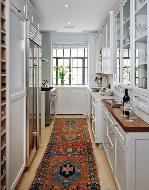
This Kitchen has long since been on my 'Love it' list. Ample storage, even a snazzy wine area and they changed the counter top to a rich wood for the butler pantry area. And lets not forget about that great punchy rug.
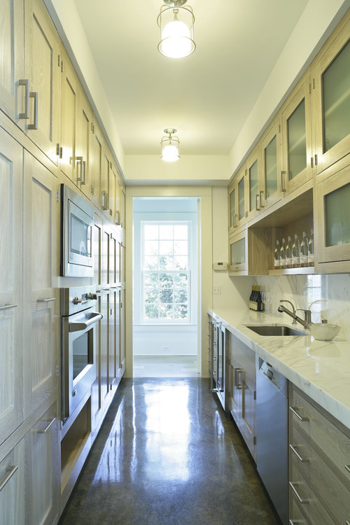
When you have a galley style, chances are you have less quantities for finishes, so you can up the budget right? This high end marble, backsplash and light fixture really take this to another level. I also really like the portal window in the swinging door, very fancy restaurant no?
This updated farmhouse galley rocks. the White washed cabinets are rustic, yet modern clean lines and that wall of storage is enough for anyone. They even managed to squeeze in a beverage cooler.
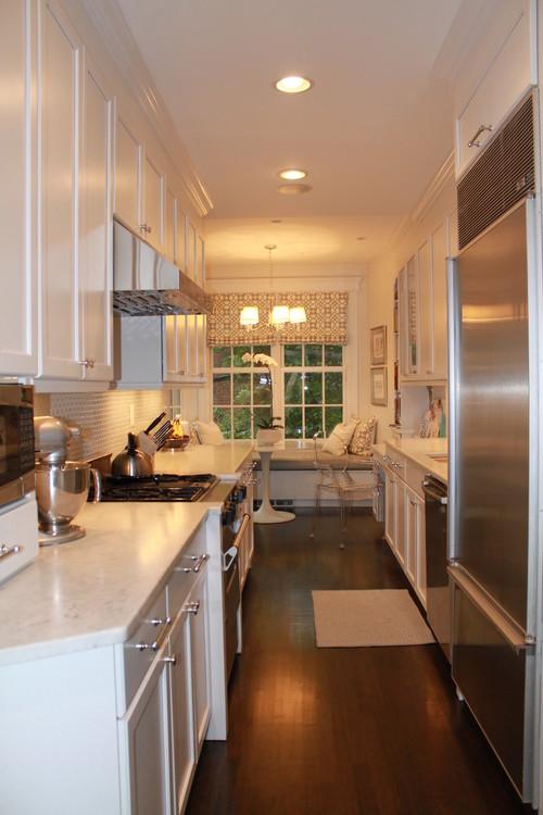
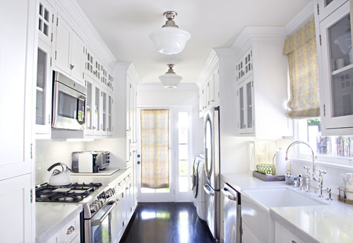
Keeping the countertop clutter to a minimum is a must when you are tight on space, and monochromatic helps the eye to keep moving, making it feel larger.
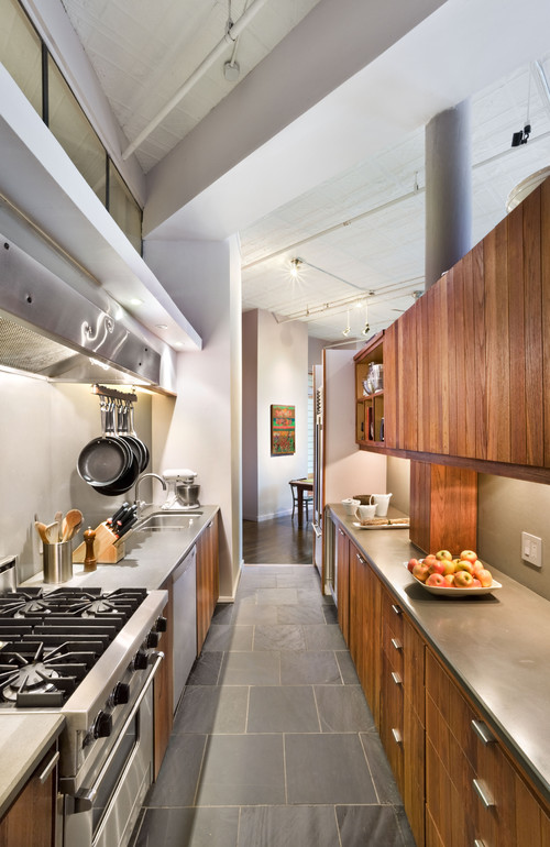
This lofty galley keeps one side open with no upper cabinets, making it feel more open than closed in. If there were two rows of darker wood uppers it may feel cramped. Also notice the solidity of the concrete countertops, very smooth.
Lighting, both natural and fixtures help with a Galley, the more windows the better because it helps to visually expand the space.
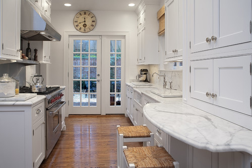
Just because you don't have an island to gather around doesn't mean you can't create an eat in area. Wouldn't this be great for a cup of coffee and a visit? Or helping the kids on homework while cooking dinner?
This Kitchen has long since been on my 'Love it' list. Ample storage, even a snazzy wine area and they changed the counter top to a rich wood for the butler pantry area. And lets not forget about that great punchy rug.
When you have a galley style, chances are you have less quantities for finishes, so you can up the budget right? This high end marble, backsplash and light fixture really take this to another level. I also really like the portal window in the swinging door, very fancy restaurant no?
This updated farmhouse galley rocks. the White washed cabinets are rustic, yet modern clean lines and that wall of storage is enough for anyone. They even managed to squeeze in a beverage cooler.
This lofty galley keeps one side open with no upper cabinets, making it feel more open than closed in. If there were two rows of darker wood uppers it may feel cramped. Also notice the solidity of the concrete countertops, very smooth.
Lighting, both natural and fixtures help with a Galley, the more windows the better because it helps to visually expand the space.
Just because you don't have an island to gather around doesn't mean you can't create an eat in area. Wouldn't this be great for a cup of coffee and a visit? Or helping the kids on homework while cooking dinner?
This dead end kitchen looks pretty low on ceilings, but the white cabinets to the ceilings make it feel airy. They also made good use of the under the stairs area instead of a dead space.




No comments:
Post a Comment